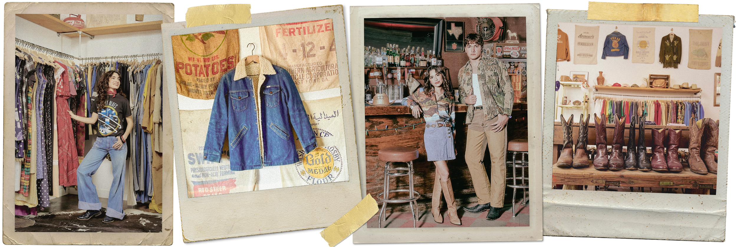
Brand Identity, Illustration, Social Launch
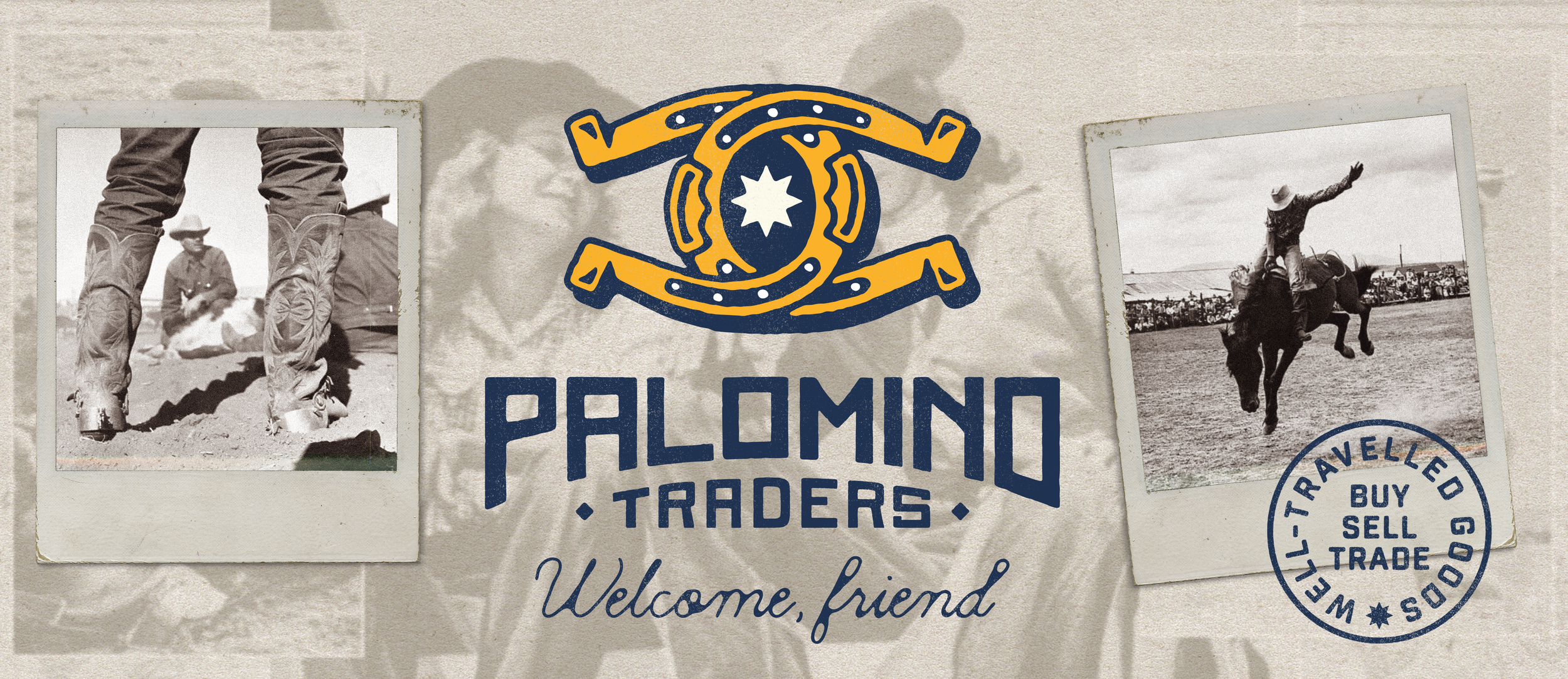
Palomino Traders
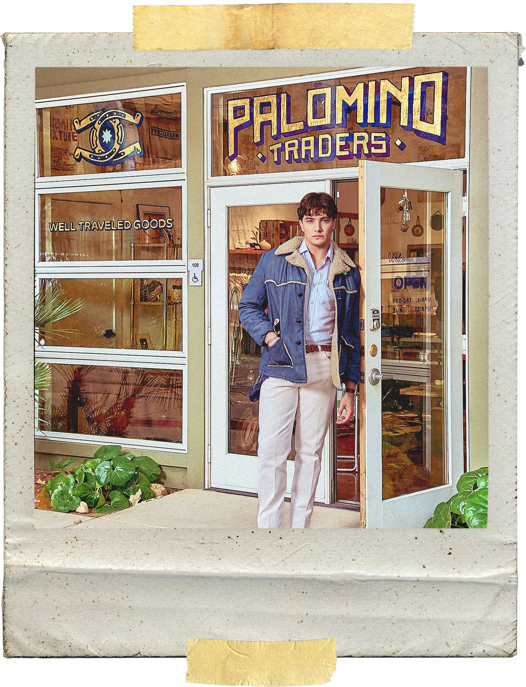
Palomino Traders is a vintage retail concept inspired by the American West and the owner’s upbringing as a barrel racer. The brand blends heritage references with a contemporary retail experience, balancing authenticity with approachability.
A brand built on grit, nostalgia, and modern retail, rooted in the visual language of historic trading posts.


Palomino Traders draws from the visual language of historic trading posts—places shaped by exchange, movement, and lived experience. The identity leans into that sense of history, using bold, enduring forms paired with subtle imperfections to create something that feels both familiar and distinctly human.
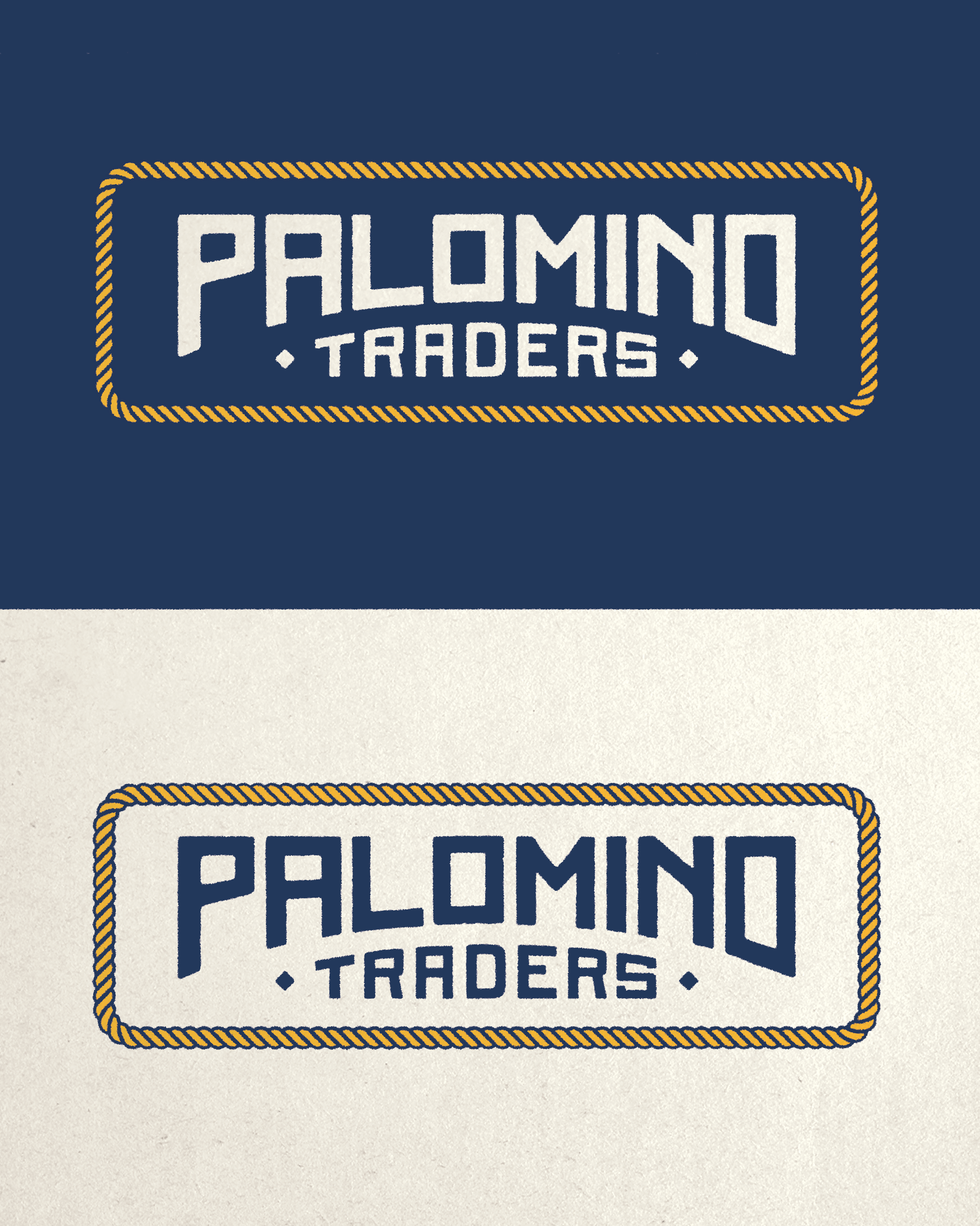
Hand-drawn elements and tactile references ground the system in real materials and craftsmanship, avoiding anything overly polished or ornamental. Instead, the brand embraces a sense of wear, warmth, and character—reflecting a business built on story, not surface.
The result is a flexible identity that moves between retail, packaging, and environment without losing its voice—rooted in heritage, but designed to live in the present.
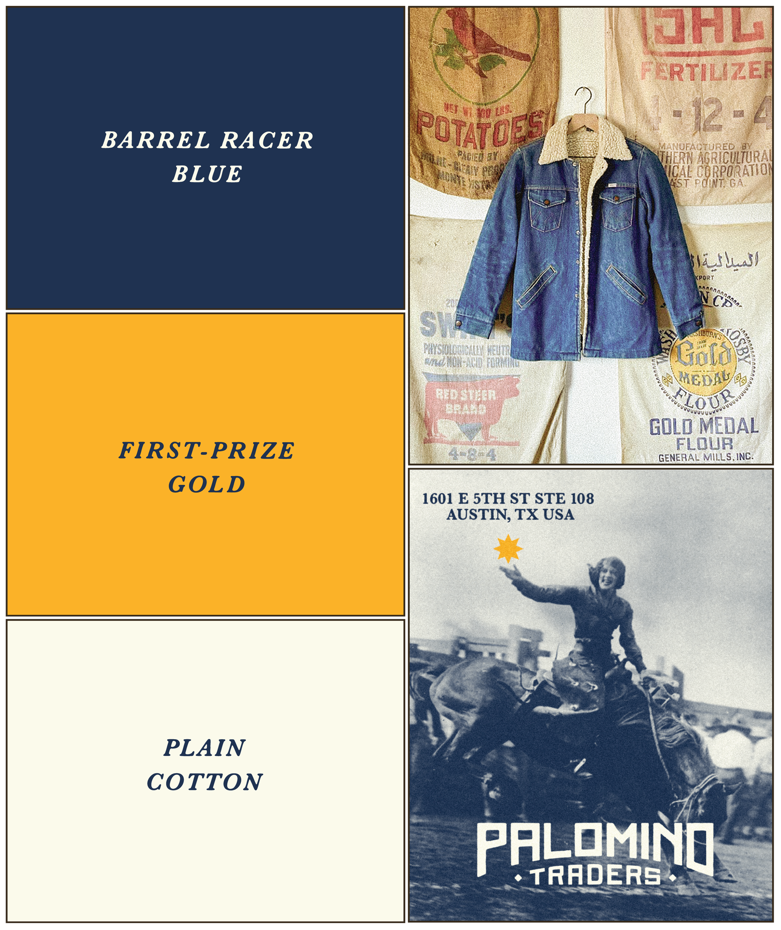
Brand Colors
The color palette for Palomino Traders is heavily inspired by the vintage feed sacks and agricultural textiles that surrounded the client growing up and still live throughout the shop today. Deep Barrel Racer Blue, rich First-Prize Gold, and soft Plain Cotton create a palette that feels nostalgic, hardworking, and distinctly Western without leaning overly rustic. The colors reference faded denim, grain mills, old rodeo posters, and sun-worn fabric labels, giving the brand a sense of heritage and authenticity that feels collected over generations.